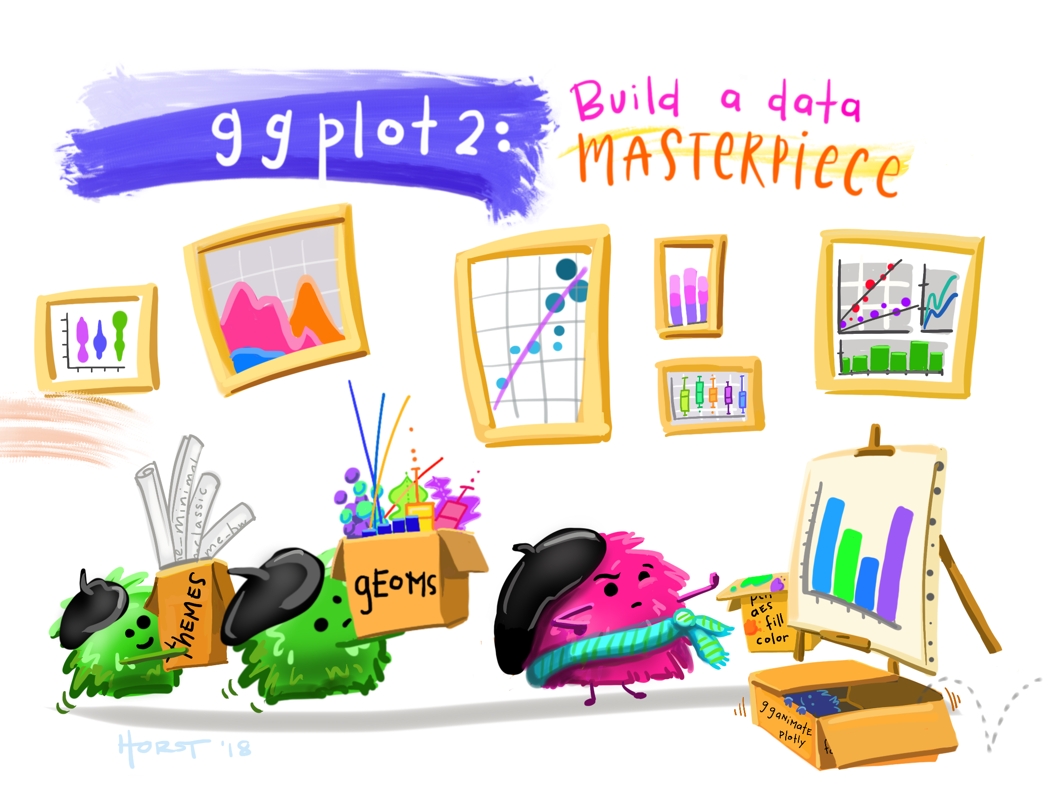
Visualization with `ggplot2`
- Download the in-class written R Markdown here.
Learning Outcomes
- Use the capabilities of ggplot2.
ggplot()andaes()for mapping data to aesthetics- Choosing and adding “geoms” to display data
- Adjusting individual plots or creating multiple plots
- Reducing Overplotting
- Adjusting formatting: Color Themes, Titles, Scales
- Apply basics of data visualization
- Scatterplots - Two quantitative
- Boxplots, Barplots - One Quantitative and One Categorical
- Histograms and Density Plots - One quantitative
- Separate by facets
- Coding by a categorical variable
- Smoothing (loess and OLS)
Lesson prep
A package we will be using extensively in this course is tidyverse. You may remember, a package is like an app on your phone which gives you extra features built off the model. To download a package, we use install.packages("package-name") to get it onto our computer. We also will need a special package called “palmerpenguins,” so Let’s download those now.
install.packages(c("tidyverse", "palmerpenguins"))
You’ll noticed I used an r trick here to download more than one package at a time. the c() function combines multiple values into a vector.
Once those are downloaded, we have to open the package up every time we use R. We’ll generally use library() to bring it into our working session, but there are other ways.
library("palmerpenguins")
library("tidyverse")

data("penguins")
The ‘ggplot2’ package
Foundational Concepts Underlying the ggplot2 Package
- The ggplot2 package is based on a set of concepts called the “Grammar of Graphics” (GoG)
- The grammar of graphics is an architectural approach to creating graphs
- The GoG emphasizes modularity through layers so users can create better graphics more easily
- The GoG is structured to enable transparency, maintainability, and reproducibility.
Benefits
- The ‘ggplot2’ package is relatively easy to use for most tasks since it works well with other tidyverse packages
- The default plots are better looking
- There are many extensions to ggplot2 with a variety of themes and specialized plots
- All visualization approaches require creativity and in-depth work if you want to do something unusual
- If no package has done it before, it may be time to create your own plotting function if you want to change a lot of defaults
- Regardless of the approach, we will be plotting for analysis and to communicate to others
- Avoid adding gratuitous elements that can distract the viewer
- Minimize redundant information that can confuse the viewer
- Do not put two different
Yaxes on the same plot. It’s difficult to do for a good reason.
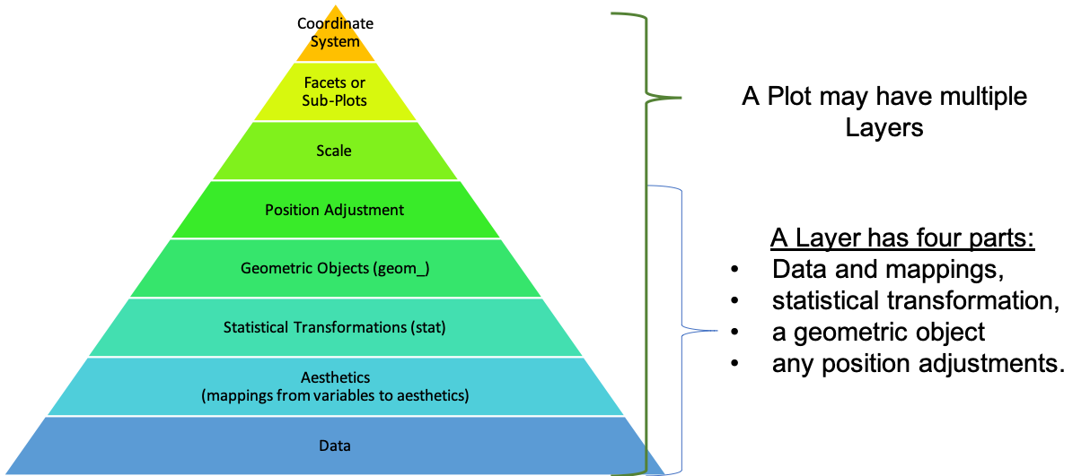
Elements of the Grammar of Graphics
-
The ‘ggplot2’ package uses functions to work with the following GoG elements:
- Data Frames (
data): Contains the variables that you want to plot. - Aesthetic Mappings (
mapping): Assign variables to aesthetics (e.g.\(x\)-coordinate,\(y\)-coordinate, color, shape, transparency, line thickness, line type) of geometric objects. - Transformations (
stat): Transforms data into a new data frame for plotting- e.g. calculating (and then plotting) the number of observational units in each bin for a histogram.
- Geometric Objects (
geom): The type of plot you want (e.g. scatterplot, line plot, histogram, barplot) - Position Adjustments (
position): Jitter objects, overlap histogram bins, etc.. - Facets: Create multiple plots, one for each value of a categorical variable.
- Coordinate systems: Cartesian/polar
- Data Frames (
-
The GoG approach works with the elements as individual layers in building or creating a graph.
 Hadley Wickham1
- You can get most of your plotting work done by manipulating four elements:
- data frames - the input data
- aesthetic mappings - where things go and what they look like, … created using
aes()- See help for aesthetic and look at the vignette for ggplot2: ggplot2-specs
- geoms - type of plot geometry, e.g., point, bar, column, hex, …, created using
geom_*(), and - facets - creating multiple graphs using
facet_grid()orfacet_wrap()to show an additional dimension of the data
- We won’t modify the other GoG elements too often.
The ggplot() function is the Workhorse of ggplot2
- The
ggplot()function creates the blankggobject - the canvas. - It has two main arguments:
data: Must be a data frame. Contains the variables that you want to map to aesthetics.mapping: Specifies which variables map to which aesthetics.- Aesthetics may include: data to go on the x axis, data to go on the y axis, color, shape, fill, transparency, …
- You almost always use the
aes()function to perform this mapping.
Basic function
ggplot(DATA, mapping = aes(x = X, y = X)) +
  geom_TYPE()
- To add another element to the layer, we use a
+sign ggplot()is almost always followed by a space and then a+and then on the next line, we can add ageom_*()function- Make sure the
+is at the end of a line and not at the beginning of a line.
- Make sure the
- The
*in thegeom_*()function is replaced by a name which specifies which geometric objects receive the aesthetic mapping and should be shown.- The help for
geom_shows many possiblegeom_*()functions
- The help for
Comparing Two Quantitative Variables
Scatterplots: geom_point()
- Scatterplots (or point plots) explore the relationship between two quantitative variables.
- “Quantitative” variables are numeric variables where at least one arithmetic operation ($+/-/\times/\div$) makes sense.
- E.g.
flipper_length_mmandbody_mass_gare two quantitative variables as you can add and subtract them. - Not all variables with numbers are quantitative (e.g. phone numbers).
- Not all operations make sense on quantitative variables, e.g., multiplying two temperatures
- E.g.
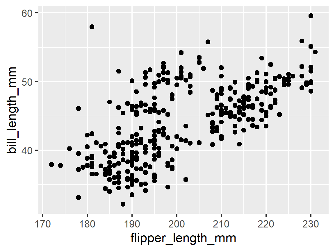
- After creating the
ggblank canvas and mapping, use+to add ageom_point()to create a scatterplot:- Use
ggplot()to create theggobject and the aesthetic mapping usingaes() - Map
flipper_length_mmonto thexaesthetic andbill_length_mmonto theyaesthetic. - Hit enter after the `+ and note the indentation, then,
- Add
geom_point()
- Use
ggplot(penguins, mapping = aes(x = flipper_length_mm, y = bill_length_mm)) +
  geom_point()
-
This plot indicates a positive relationship between
flipper_length_mmandbody_mass_g- asflipper_length_mmincreases,body_mass_gincreases. -
Notice: it is our choice as to which variables maps to the
xaxis and which maps to theyaxis. -
Typically the Response variable goes on the
yaxis and the potential Explanatory variable go on thexaxis- Plot Variable A “vs” Variable B usually means map Variable 2 to the
xaxis and Variable 1 to theyaxis - Plot A as “a function of” B usually means map Variable 2 to the
xaxis and Variable 1 to theyaxis
- Plot Variable A “vs” Variable B usually means map Variable 2 to the
-
Changing the mapping does not change the nature of the relationship but can change how most people will interpret your plot as to which variable might be explaining or affecting or associated with the other variables values.
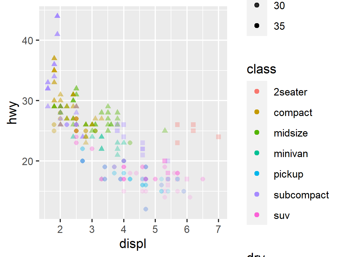
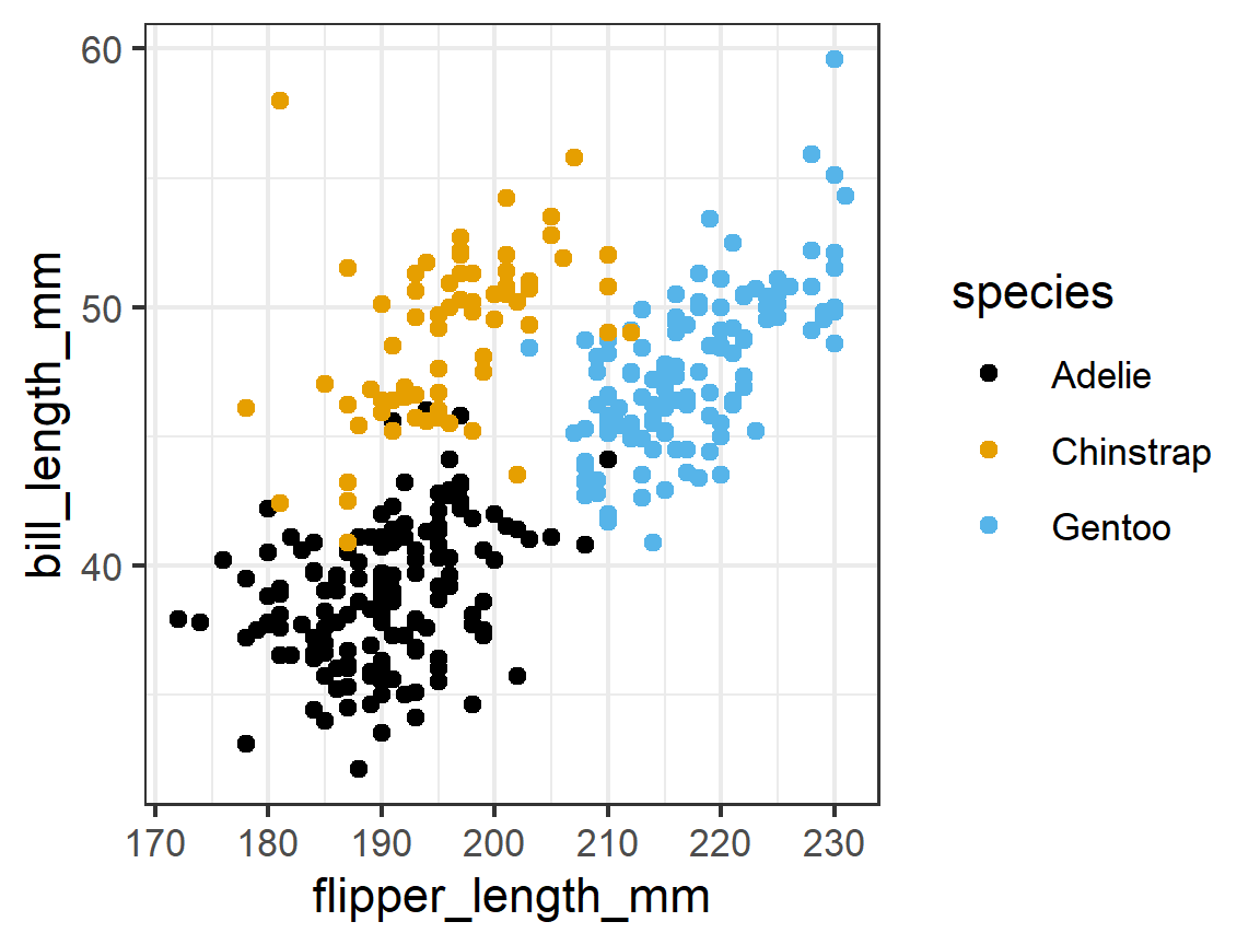
Adding a Third Dimension by Coding (or Annotating) by a Categorical Variable
-
We might be interested in looking at the association of two quantitative variables based on different values of a categorical variable.
-
A categorical variable characterizes observational units based on membership in different groups or categories
- Categorical variables have limited number of distinct values or levels.
- Examples might include Eye color, Hair color, Religion, Country, or
- The
mpgdata set hasdrvas a categorical variable with three levels for the the type of drive train: where f = front-wheel drive, r = rear wheel drive, 4 = 4 wheel drive
-
We can map categorical variables to multiple aesthetics: e.g.,
color(better) orshape(worse) -
Since Categorical variables have limited numbers it’s often easy to distinguish the levels
-
When you get into more than 10, say if you were using the 50 States, the colors can get hard to distinguish
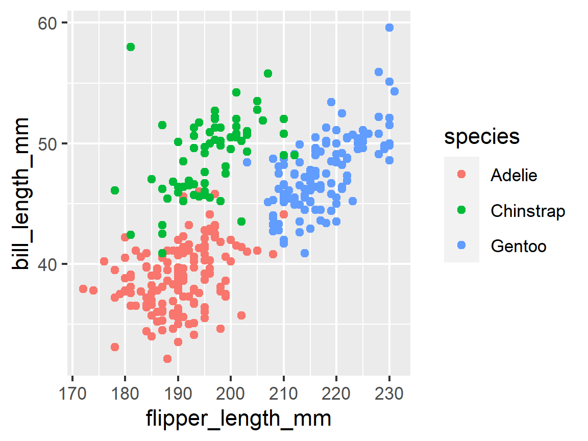
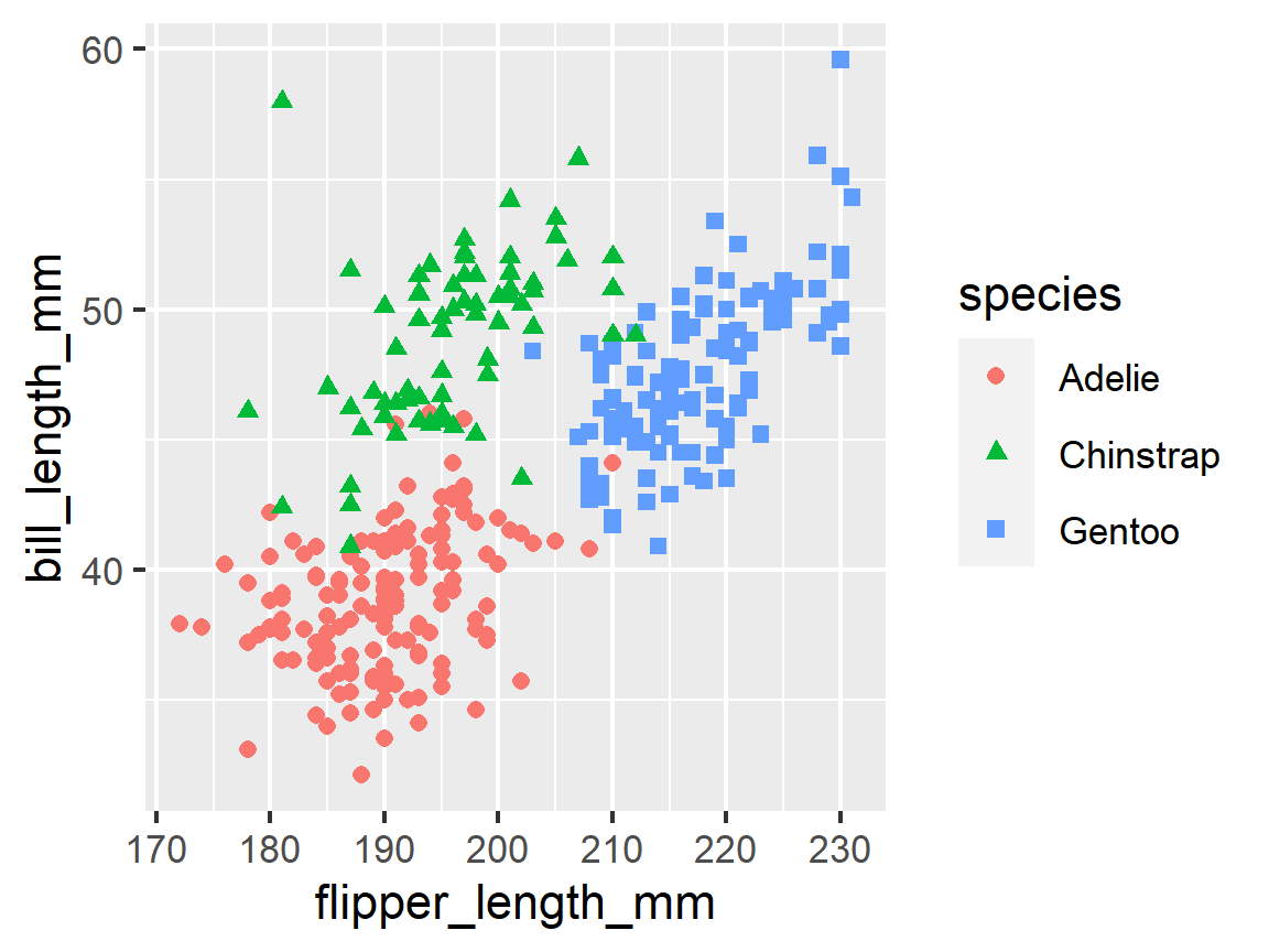
In our case, you may notice a slight clustering in the previous plot we made. What if these are based on different penguin species?
ggplot(penguins, mapping = aes(x = flipper_length_mm, y = bill_length_mm,
                               color = species)) +
  geom_point()
What if we wanted to distinguish by both color and shape to really accentuate the differences?
ggplot(penguins, mapping = aes(x = flipper_length_mm, y = bill_length_mm,
                               color = species,
                               shape = species)) +
  geom_point()
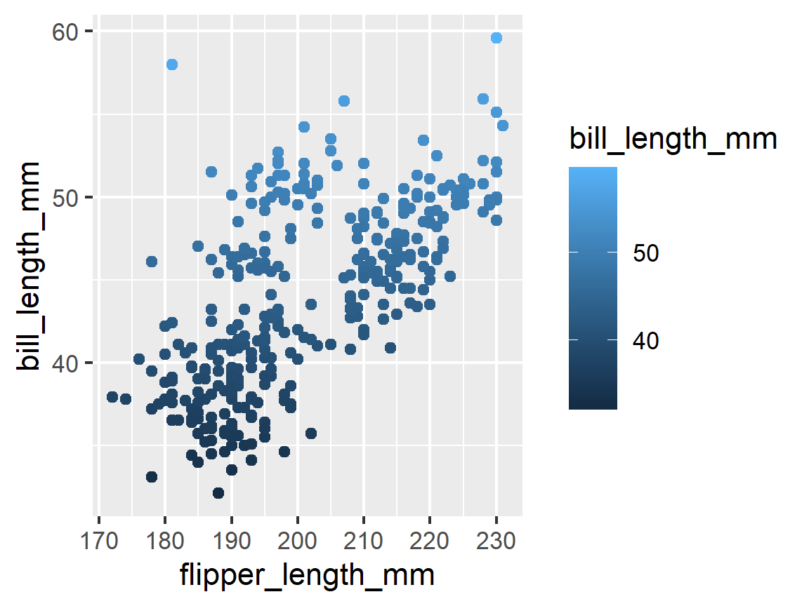
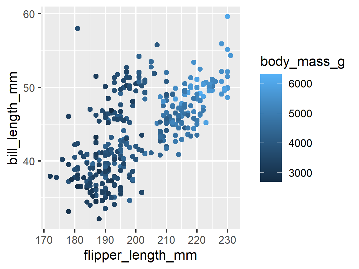
Adding a Third Dimension by Coding (or Annotating) by a Quantitative Variable
- If we want to look at the association between two quantitative variables at different levels of a third quantitative variable, we can map that third quantitative variable to an aesthetic as well.
- There are three main choices:
color(good), or size (worse unless points have minimal overlap).
 # Coding by color - gives a smear or spectrum of colors,

ggplot(penguins, mapping = aes(x = flipper_length_mm, y = bill_length_mm,
                               color = bill_length_mm)) +
  geom_point()
ggplot(penguins, mapping = aes(x = flipper_length_mm, y = bill_length_mm,
                               color = body_mass_g)) +
  geom_point()
 # Coding by size, often called a "bubble chart"

ggplot(penguins, mapping = aes(x = flipper_length_mm, y = bill_length_mm,
                               size = body_mass_g)) +
  geom_point()
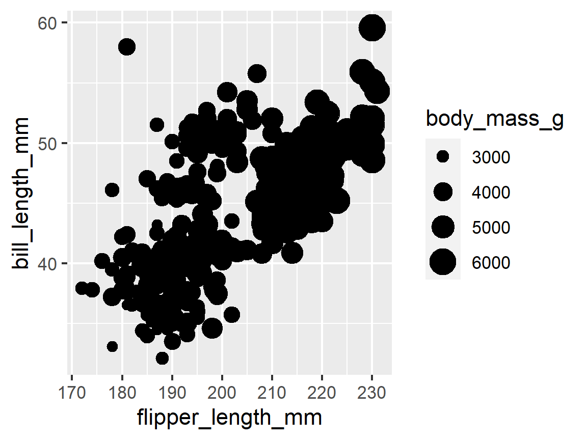
We can map multiple variables to multiple aesthetics at the same time, but the resulting plot might get too complicated to be useful.
In the plot above, there’s too much noise and the point of the plot is not effectively communicated. Keep it simple.
Overplotting
- Overplotting is when there is so much data with similar values the plotted points overlap or cover each other up to so it is hard to interpret the results.
- When variables are rounded or occur around common values, you will likely experience overplotting.
ggplot(penguins, mapping = aes(x = year, y = bill_length_mm,
                               color = species)) +
  geom_point() +
  labs(title = "No adjustment")
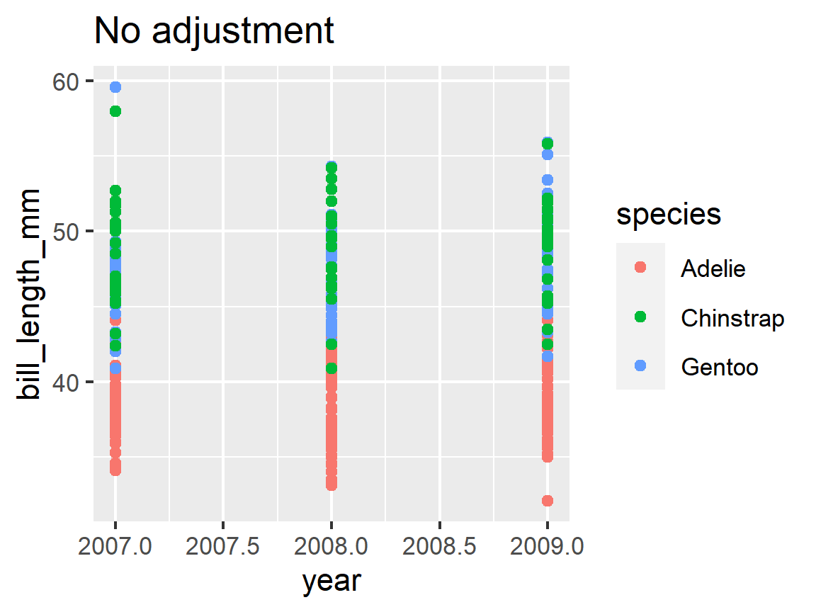
- Three ways to counteract this for a given type of plot:
- If you have a large data set, set the transparency (
alpha) for all points to be low, e.g., 0.1. - If you have a small data set, use
geom_jitter()to have R change the values slightly in the x and y directions - If you have a really large dataset, randomly sub-sample the observational units (chapter 5).
- If you have a large data set, set the transparency (
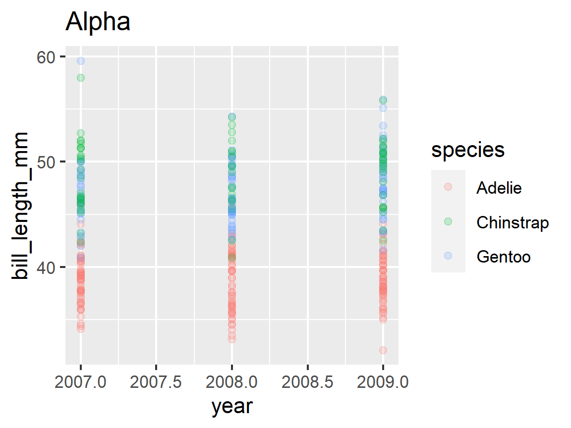
alpha transparency
ggplot(penguins, mapping = aes(x = year, y = bill_length_mm,
                               color = species)) +
  geom_point(alpha = 0.2) +
  labs(title = "Alpha")
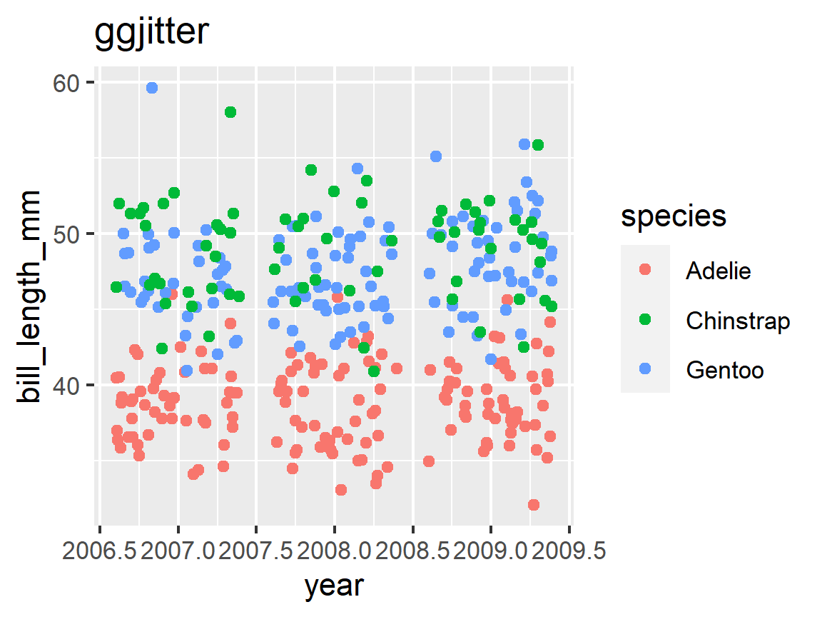
geom_jitter
ggplot(penguins, mapping = aes(x = year, y = bill_length_mm,
                               color = species)) +
  geom_jitter() +
  labs(title = "ggjitter")
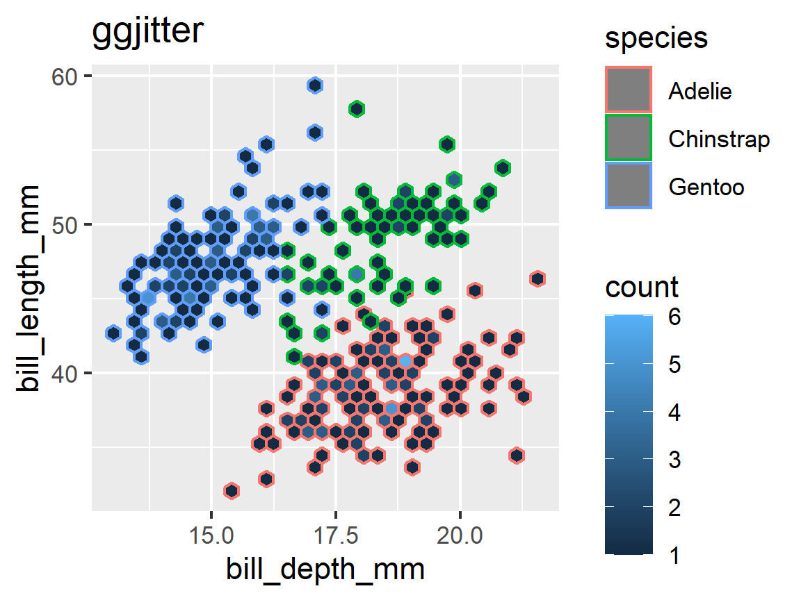
geom_hex()
ggplot(penguins, mapping = aes(x = bill_depth_mm, y = bill_length_mm,
                               color = species)) +
  geom_hex() +
  labs(title = "ggjitter")
Adding a regression line with smoothing: geom_smooth()
- Using a smoothing lines is often helpful to see if there is a potential relationship between variables
geom_smooth()will create trend lines (either linear or locally curved) and plot these.- The curve is the default “method.” So is showing gray bands for the standard errors (“se”)
Let’s return to our first plot and see what the smoothed line looks like.
ggplot(penguins, mapping = aes(x = flipper_length_mm, y = bill_length_mm)) +
  geom_point() +
  geom_smooth()
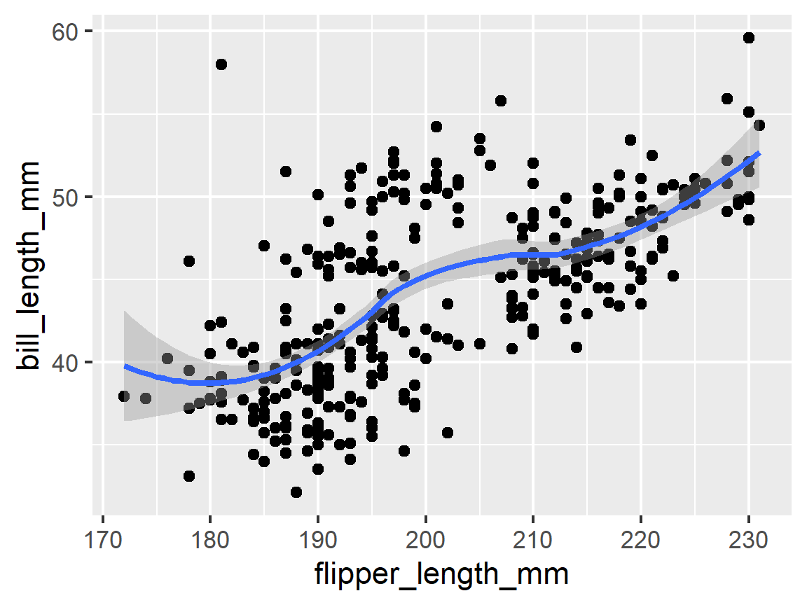
- The default for
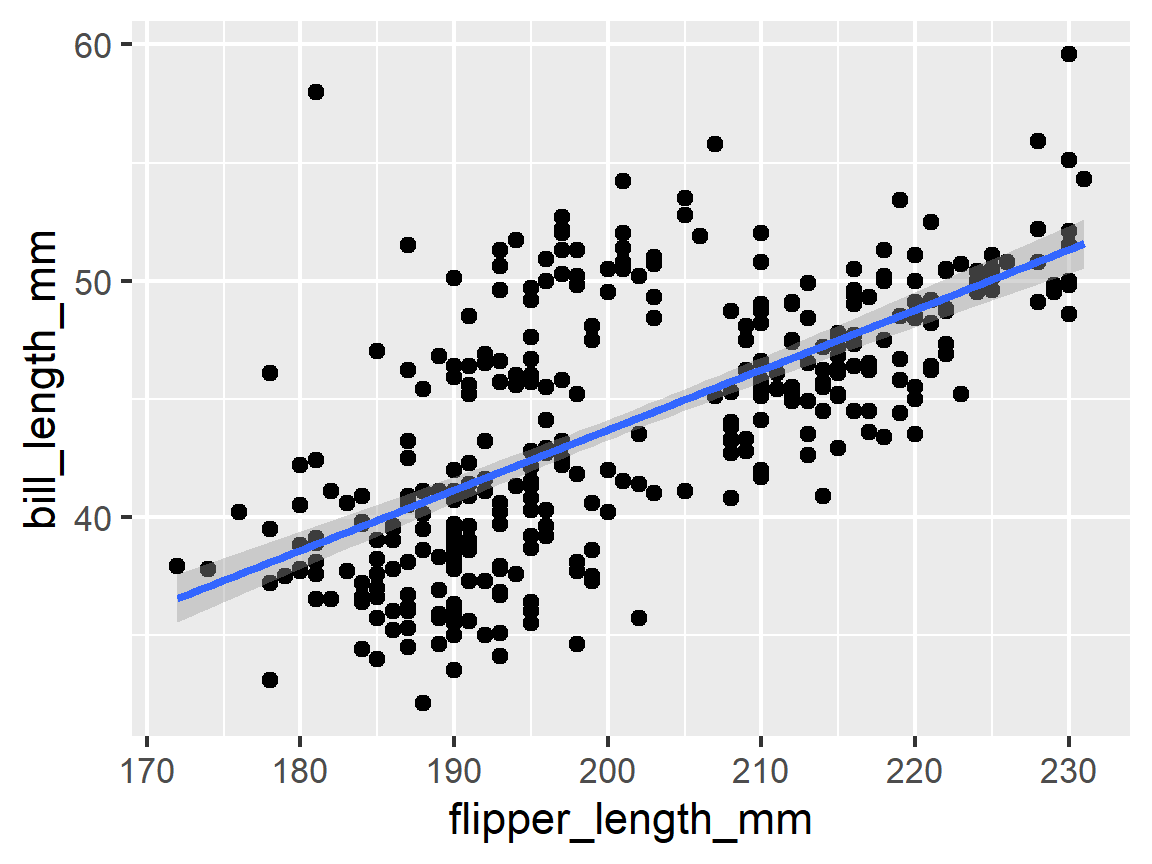
geom_smooth()is to calculate a curve (a polynomial loess smoother (see help)), but other options are available. Loess tends to be majorly overfit to the data. - We can plot the Ordinary Least Squares (OLS) linear regression fit by changing setting the
methodargument tomethod = lmfor linear model.
ggplot(penguins, mapping = aes(x = flipper_length_mm, y = bill_length_mm)) +
  geom_point() +
  geom_smooth(method = "lm")
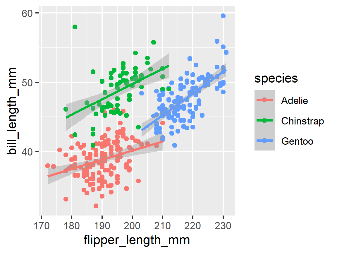
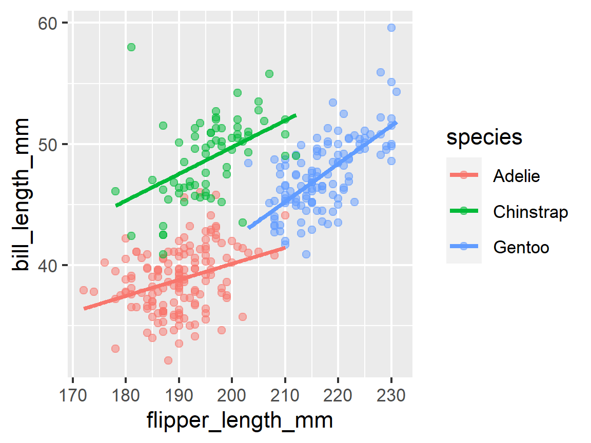
ggplot(penguins, mapping = aes(x = flipper_length_mm, y = bill_length_mm,
                               color = species)) +
  geom_point() +
  geom_smooth(method = "lm")
ggplot(penguins, mapping = aes(x = flipper_length_mm, y = bill_length_mm,
                               color = species)) +
  geom_point(alpha = 0.5) +
  geom_smooth(method = "lm", se = FALSE)
Labels
How do I make our final plot look nicer? A great place to start is with themes and labels to express our intentions better.
To add labels, we add a new layer to our ggplot called labs. Labs has many options, including:
- title = ""
- subtitle = ""
- x = ""
- y = ""
- caption = "" Let’s try to add a few of those.
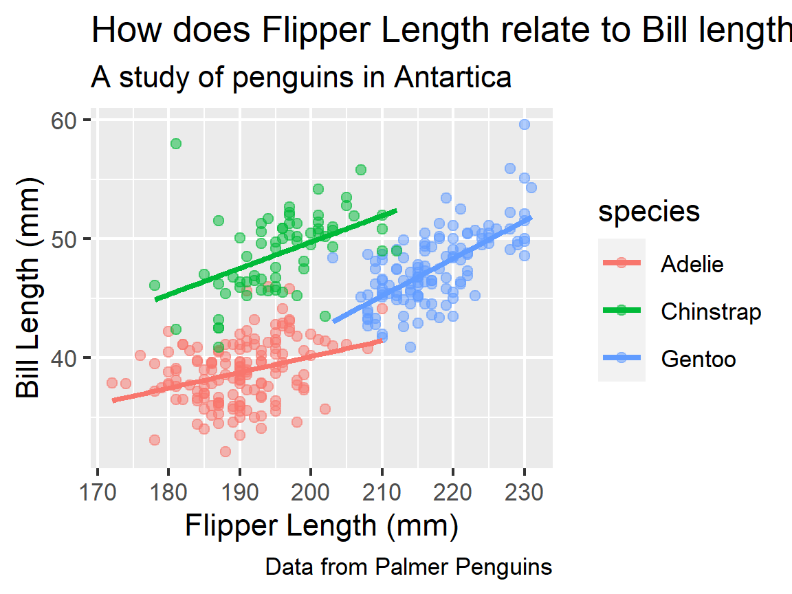
ggplot(penguins, mapping = aes(x = flipper_length_mm, y = bill_length_mm,
                               color = species)) +
  geom_point(alpha = 0.5) +
  geom_smooth(method = "lm", se = FALSE) +
  labs(title = "How does Flipper Length relate to Bill length?",
       subtitle = "A study of penguins in Antartica",
       x = "Flipper Length (mm)",
       y = "Bill Length (mm)",
       caption = "Data from Palmer Penguins")
Themes
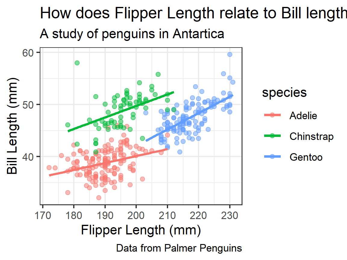
Themes can be equally important to making our plot attractive. I personally can’t stand the grey background of the plot. ggplot2 has a lot of themes you can use to reset multiple elements of the plot at once. theme_bw() black and white, changes to a white background and is popular. My favorite is theme_minimal(). Try out a few different theme_*()s to find your favorite.
ggplot(penguins, mapping = aes(x = flipper_length_mm, y = bill_length_mm,
                               color = species)) +
  geom_point(alpha = 0.5) +
  geom_smooth(method = "lm", se = FALSE) +
  labs(title = "How does Flipper Length relate to Bill length?",
       subtitle = "A study of penguins in Antartica",
       x = "Flipper Length (mm)",
       y = "Bill Length (mm)",
       caption = "Data from Palmer Penguins") +
  theme_bw()
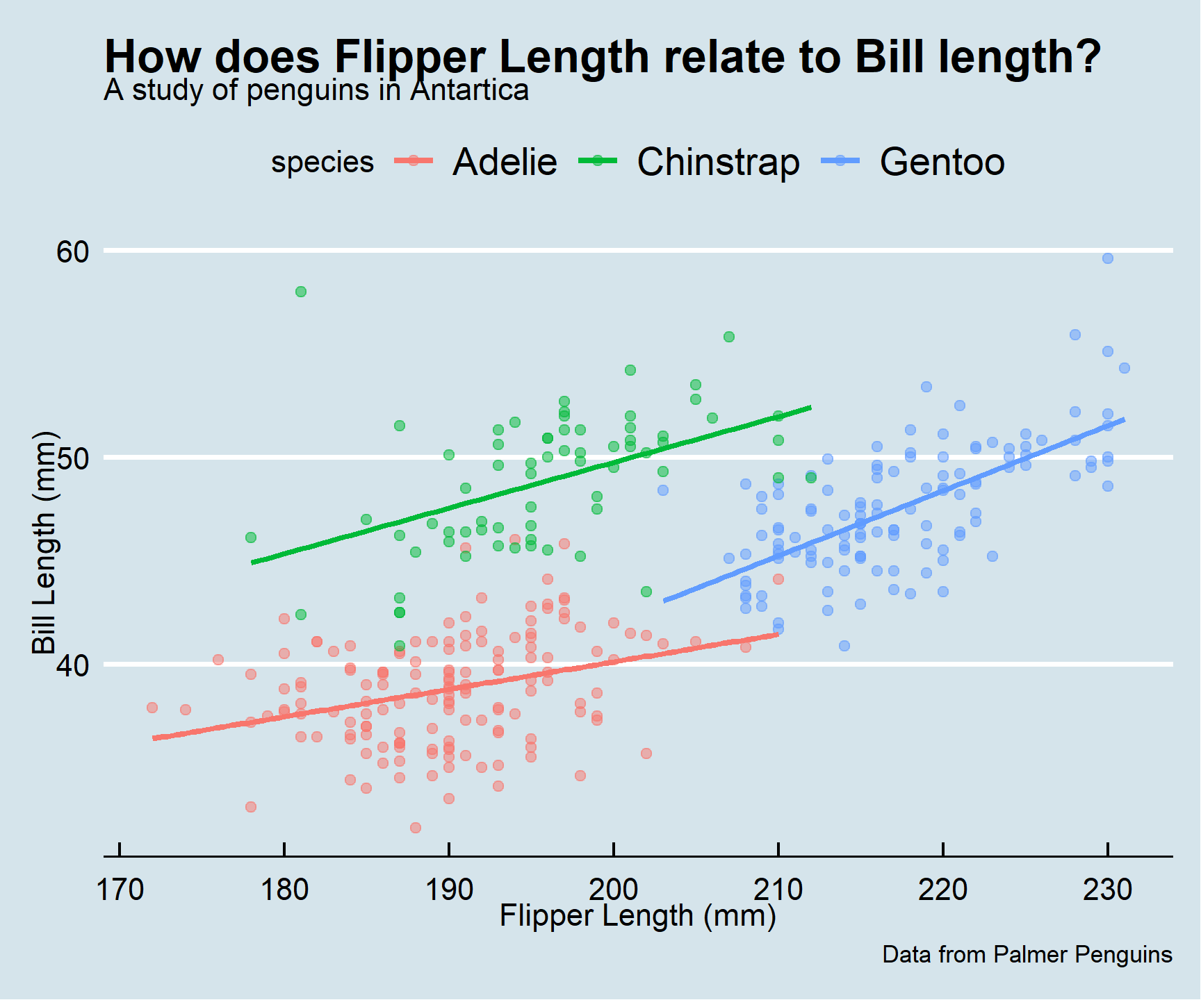
If none of these fit your fancy, everything is customizable. You can download more themes are available in the ggthemes package or create your own.
library(ggthemes)
ggplot(penguins, mapping = aes(x = flipper_length_mm, y = bill_length_mm,
                               color = species)) +
  geom_point(alpha = 0.5) +
  geom_smooth(method = "lm", se = FALSE) +
  labs(title = "How does Flipper Length relate to Bill length?",
       subtitle = "A study of penguins in Antartica",
       x = "Flipper Length (mm)",
       y = "Bill Length (mm)",
       caption = "Data from Palmer Penguins")+
  # theme_fivethirtyeight()+
  theme_economist()
Layering Geoms:
- You can add multiple layers of geoms that use the same data and aesthetic map as defined in the
ggplot()call.ggplot()passes all the mappings in theggplot(aes(...))to later functions as the default mappings
- You can equivalently define the aesthetics in the particular geom you are using.
- However, later geoms will not have access to these mappings and you would have to redefine them.
- This is sometimes what you want to do.
ggplot(penguins) +
  geom_point(mapping = aes(x = flipper_length_mm,
                           y = bill_length_mm,
                           color = species))
- Example of what happens when there is no default mapping and you forget to to specify every mapping.
# Should produce an error
ggplot(penguins) +
  geom_point(mapping = aes(x = flipper_length_mm,
                           y = bill_length_mm,
                           color = species)) +
  geom_smooth()
- Steps to differentiate the mappings for different geoms:
- Place the aesthetic mappings you want as the default (to be shared) in the
ggplot(aes())call. - Place geom-specific aesthetic mappings within the
geom_*(aes())call
- Place the aesthetic mappings you want as the default (to be shared) in the
One Categorical Variable and One Quantitative Variable.
- The Box Plot (or box and whiskers plot) is often the best way to visually assess the association between a categorical and a quantitative variable.
- A box plot is a compact representation of five summary statistics:
- The median,
- The 25th and 75th percentiles - known as the hinges, and used to calculate the Inter-quartile range (IQR),
- Lower and Upper “whiskers” (up to 1.5* IQR above and below the median), and
- All the “outlying” points - those points more than 1.5* IQR above/below the median.
- Use
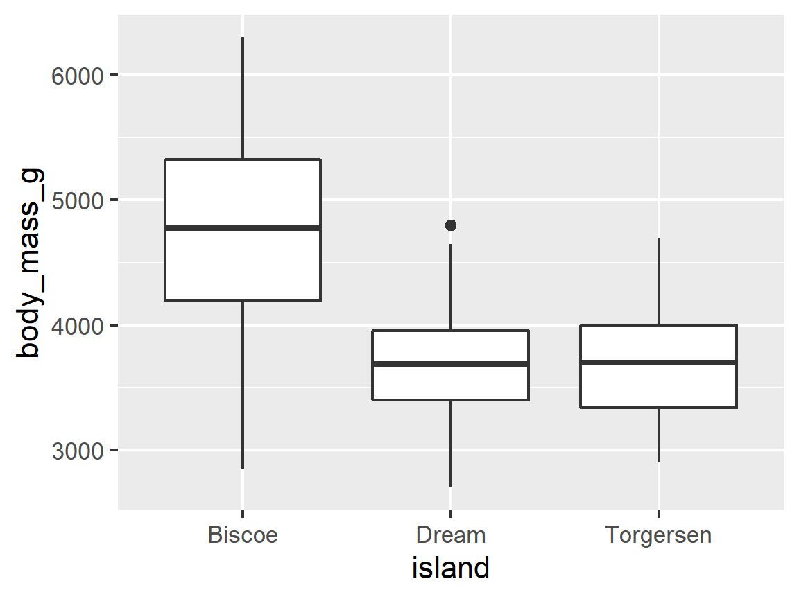
geom_boxplot()to create a boxplot. ## Box Plots -geom_boxplot()
ggplot(penguins, aes(x = island, y = body_mass_g)) +
  geom_boxplot()
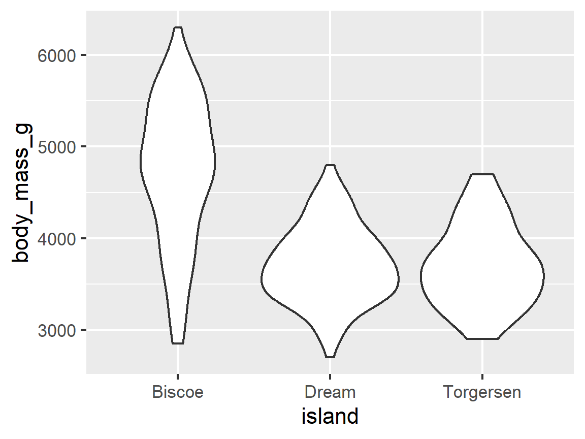
- The boxplot does not show any details of where the internal points are within the box
- An alternative is a violin plot:
geom_violin()which adds a density-style plot
ggplot(penguins, aes(x = island, y = body_mass_g)) +
  geom_violin()
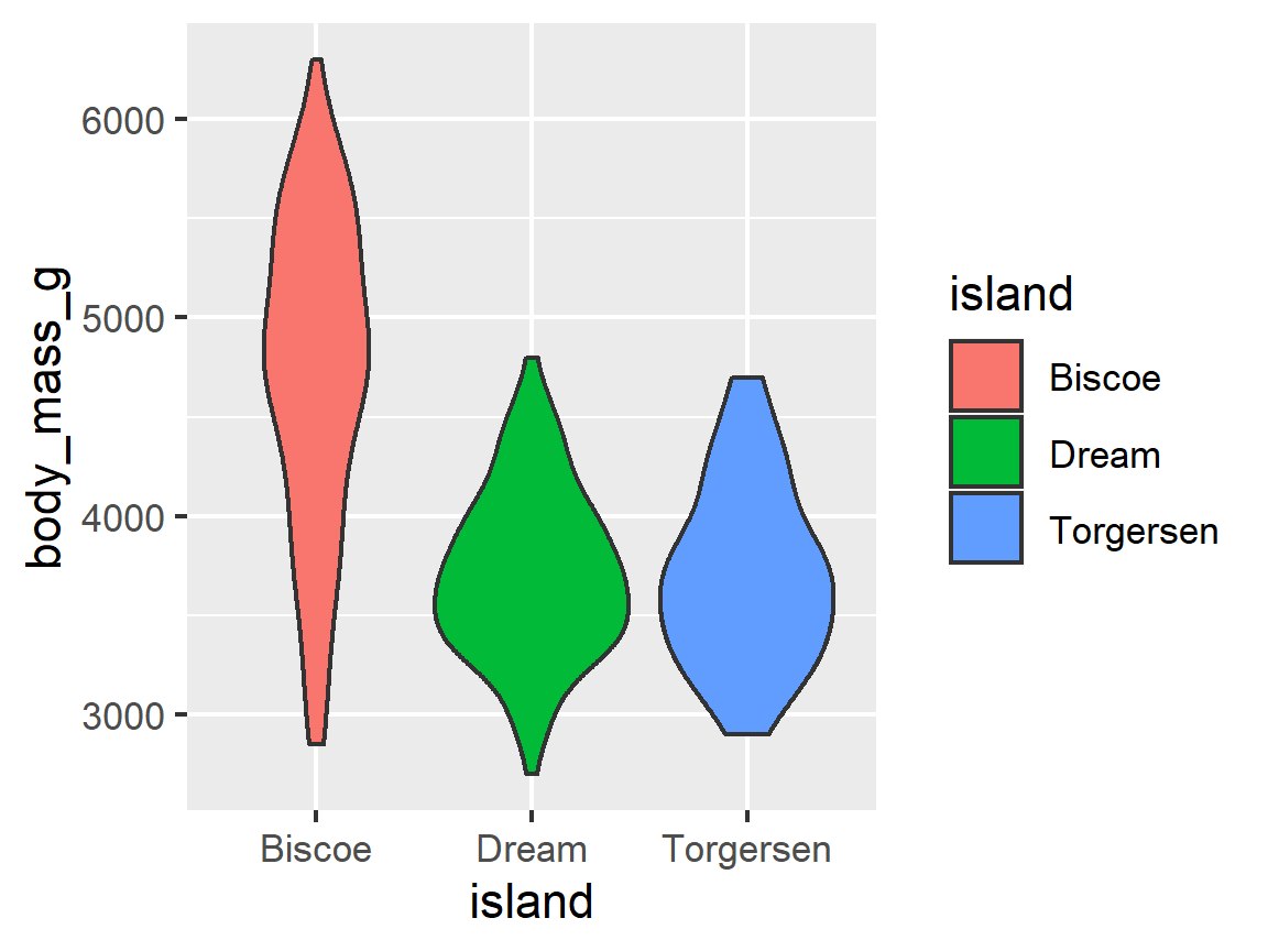
ggplot(penguins, aes(x = island, y = body_mass_g)) +
  geom_violin(aes(fill = island))
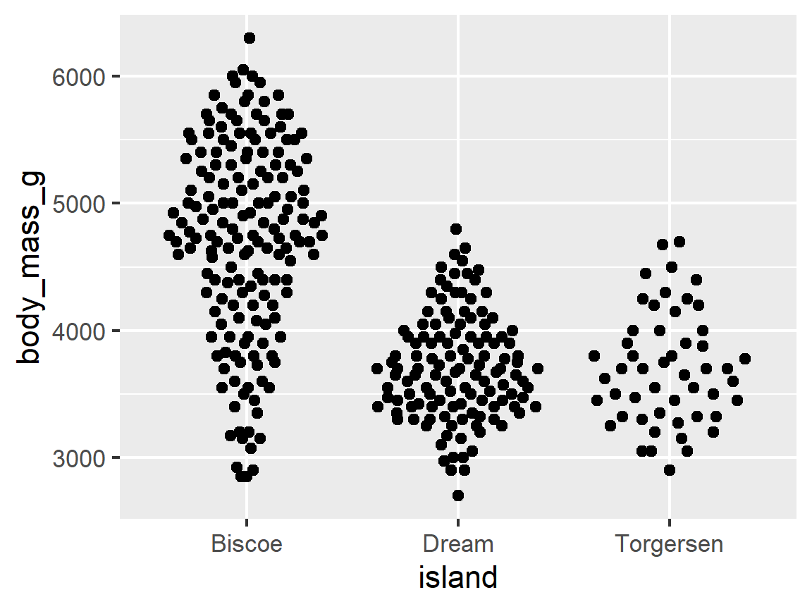
- Another alternative is the beeswarm plot from the package ggbeeswarm.
ggbeeswarm::geom_beeswarm()
ggplot(penguins, aes(x = island, y = body_mass_g)) +
  ggbeeswarm::geom_quasirandom()
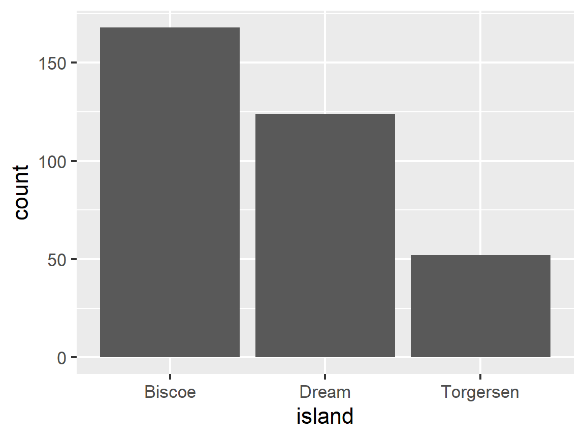
Bar Plots - geom_col()
Sometimes you just want to show a total counts across categorical variables.
ggplot(penguins, aes(x = island)) +
  geom_bar()
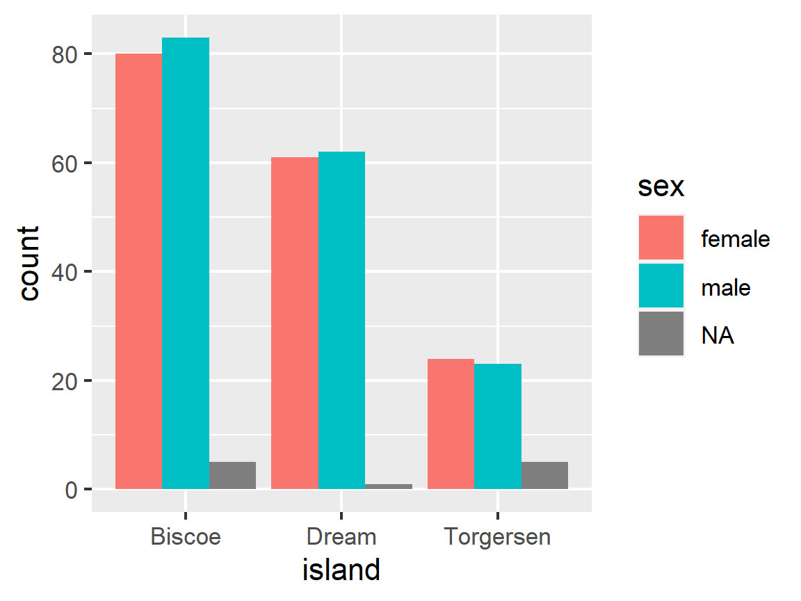
ggplot(penguins, aes(x = island, fill = sex)) +
  geom_bar(position = "dodge")
For future reference: If you’re starting with a dataset of already aggregated values, you’ll need to use a special option here to tell ggplot not to aggregate your data.
penguins %>%
  count(island, sex) %>%
  ggplot(aes(x = island, y = n, fill = sex)) +
  geom_bar(stat = "identity", position = "dodge")
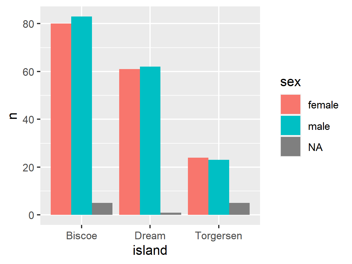
# Or, you can use geom_col() to avoid that!

penguins %>%
  count(island, sex) %>%
  ggplot(aes(x = island, y = n, fill = sex)) +
  geom_col(position = "dodge")

One Quantitative Variable
- We are often interested in understanding the shape of the distribution of a variable
- By distribution we mean what values does it takes and how often does it take each value.
- As an example, we want to see if the distribution is uniform, symmetric, or skewed (left or right), or, is it uni-modal (one hump) or bi-modal (two humps) or something interesting or unusual.
Histograms: geom_histogram()
- A histogram is useful for exploring the distribution of a quantitative variable.
geom_histogram()breaks up the range of the variables values into bins of equal width and then counts how many observations fall into each bin- The bins fall along the
xaxis and they-axis shows the counts for each bin" (automatically).
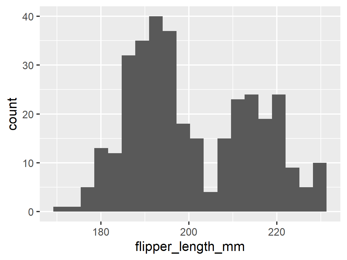
ggplot(penguins, aes(x = flipper_length_mm)) +
  geom_histogram()
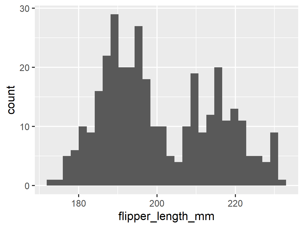
- The default for the number of bins is 30 but you can change that to get a plot that might be more meaningful.
- Play around with the
binsargument until you get something useful or nice-looking. - You can also set
binwidthas an alternative, e.g., you want each bin to be exactly 5 units wide.
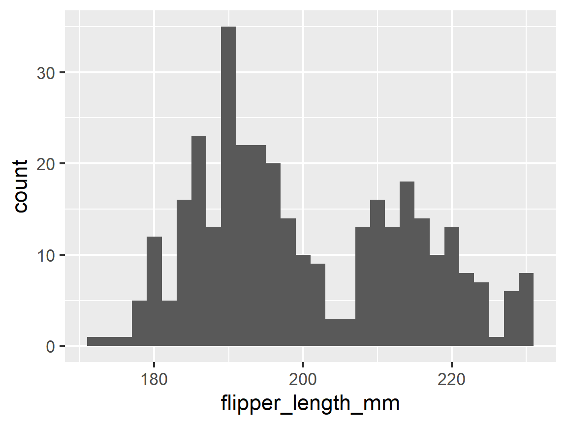
ggplot(penguins, aes(x = flipper_length_mm)) +
  geom_histogram(bins = 20)
ggplot(penguins, aes(x = flipper_length_mm)) +
  geom_histogram(binwidth = 2)
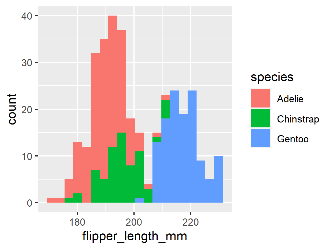
Adding a Second Dimension by Coding (Annotating) by a Categorical Variable
- You can adjust color with two options:
fill(best) orcolor(worst).filladjusts the interior color of a shape and `color’ adjusts the lines defining the shape
- The default presentation is a “stacked histogram” where the total counts per bin remain the same, but they are broken out by the chosen aesthetic within each bin
ggplot(penguins, aes(x = flipper_length_mm, fill = species)) +
  geom_histogram(bins = 20)
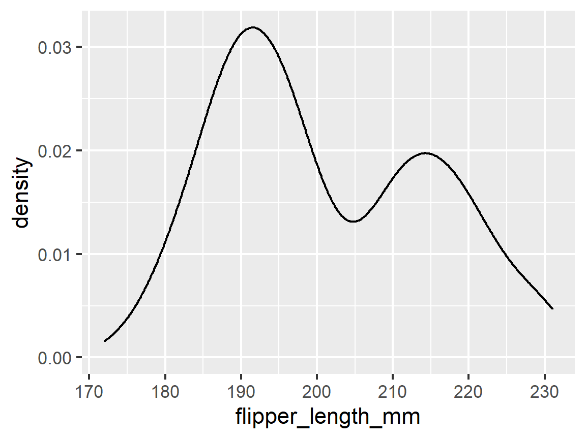
Density Plots: geom_density()
- A density is a “smoothed” histogram. It can be created with
geom_density() - Densities and histograms generally give us identical information.
ggplot(penguins, aes(x = flipper_length_mm)) +
  geom_density()
- You can plot the densities for the different levels of a categorical variable by mapping the
fillaesthetic
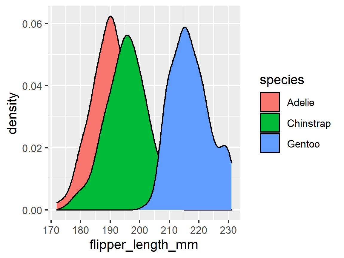
ggplot(penguins, aes(x = flipper_length_mm, fill = species)) +
      geom_density()
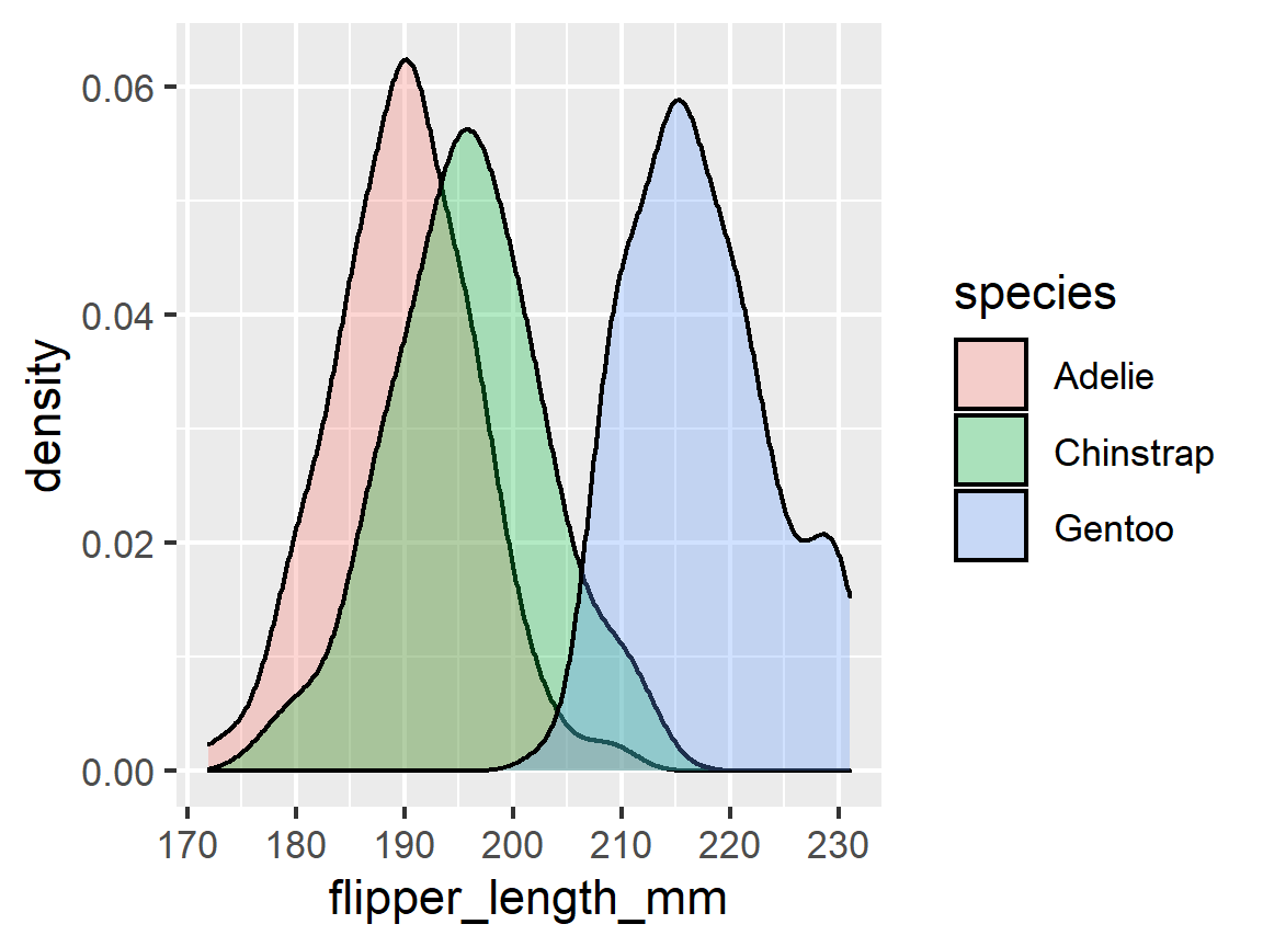
- You can change the transparency to see all densities.
ggplot(penguins, aes(x = flipper_length_mm, fill = species)) +
  geom_density(alpha = 0.3)
facets
Facets are Another Way to Add Another Dimension with a Categorical Variable
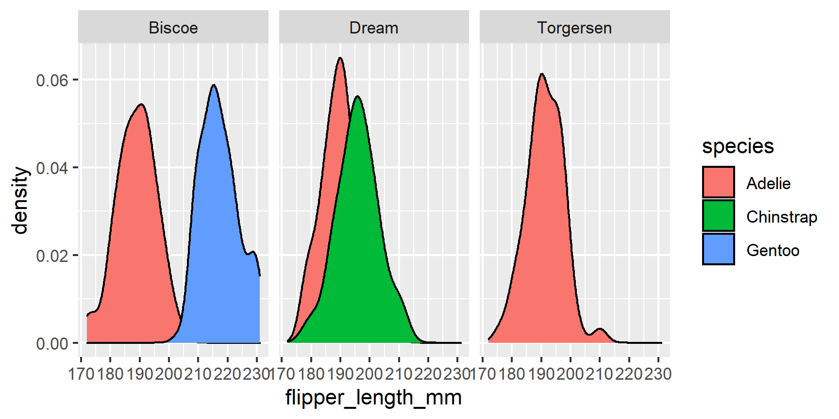
- If you want to add another dimension with a categorical variable you can create multiple plots using
facet_wrap()orfacet_grid(). facet_wrap()is used with one categorical variable- It creates a sequence of panels and wraps them around into a rectangle
ggplot(penguins, aes(x = flipper_length_mm, fill = species)) +
      geom_density() +
  facet_wrap( ~ island)
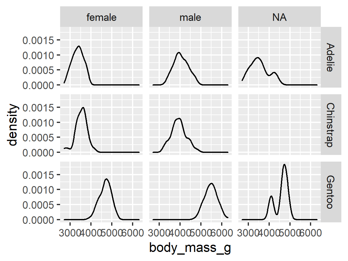
facet_grid()forms a matrix of panels defined by row and column faceting variables.- It is most useful when you have two categorical variables.
ggplot(penguins, aes(x = body_mass_g)) +
  geom_density(alpha = .3) +
  facet_grid(species ~ sex) # rows ~ cols
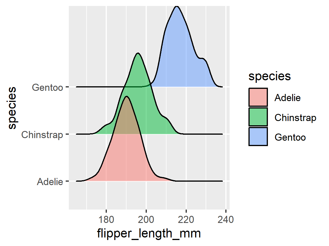
Bonus: ggridges
Another way to see density plots is using one of my favorite ggplot extensions, ggridges. This allows you to make overlapping density plots like we did above, but I find them much more readible and visually appealing.
ggplot(penguins, aes(x = flipper_length_mm, y = species,
                     fill = species)) +
  ggridges::geom_density_ridges(alpha = 0.5)
scales
Control the Scales for Different Elements of the Graph
-
Scales control how a plot maps data values to the visual values of an aesthetic.
-
To change the mapping, add a custom scale.
-
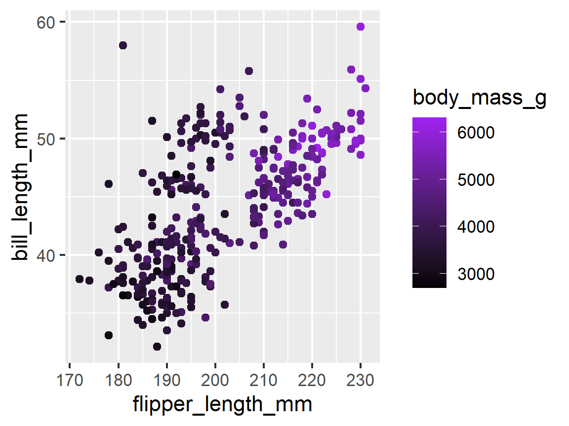
The scale of the colors determines what color is the “largest” and which is the “smallest.”
ggplot(penguins, mapping = aes(x = flipper_length_mm, y = bill_length_mm,
                               color = body_mass_g)) +
  geom_point() +
  scale_color_continuous(low = "black", high = "purple")
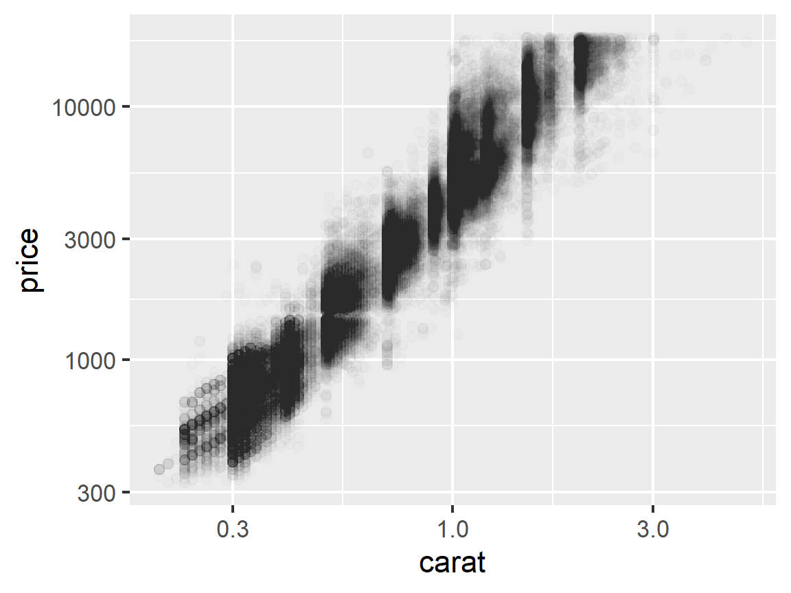
- The scale of an axis (log vs normal)
ggplot(data = diamonds, mapping = aes(x = carat, y = price)) +
  geom_point(alpha = 0.01) +
  scale_y_log10() +
  scale_x_log10()
Color Palettes
Colorblind safe palettes
- When you publish, it’s polite to use colorblind safe palettes. You can do this easily with the
ggthemespackage. - Use
scale_color_colorblind()to change the scale of thecoloraesthetic. - Use
scale_fill_colorblind()to change the scale of thefillaesthetic, etc…
ggplot(penguins, mapping = aes(x = flipper_length_mm, y = bill_length_mm,
                           color = species)) +
  geom_point() +
  theme_bw() +
  scale_color_colorblind()
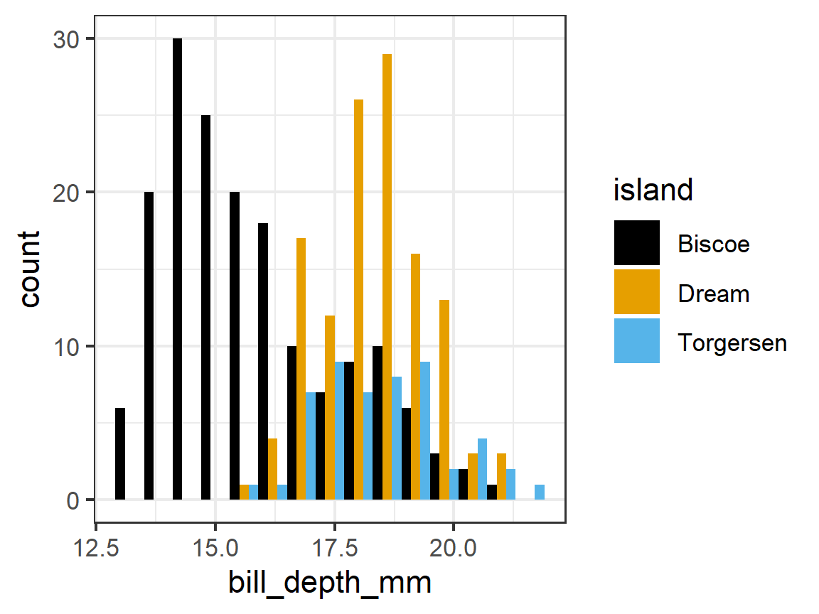
ggplot(penguins, mapping = aes(x = bill_depth_mm, fill = island)) +
  geom_histogram(position = "dodge", bins = 15) +
  theme_bw() +
  scale_fill_colorblind()
-
A popular alternative is the viridis package. It has a number of color scales designed to be:
- Colorful, spanning as wide a palette as possible so as to make differences easy to see,
- Perceptually uniform, meaning values close to each other have similar-appearing colors and values far away from each other have more different-appearing colors, consistently across the range of values,
- Robust to colorblindness, so the above properties hold true for people with common forms of colorblindness, as well as in gray-scale printing
-
You can install the package and use its functions such as you saw before
scale_color_viridis_*d*()orscale_fill_viridis_*()- replace
*withdfor discrete data,cfor continuous data
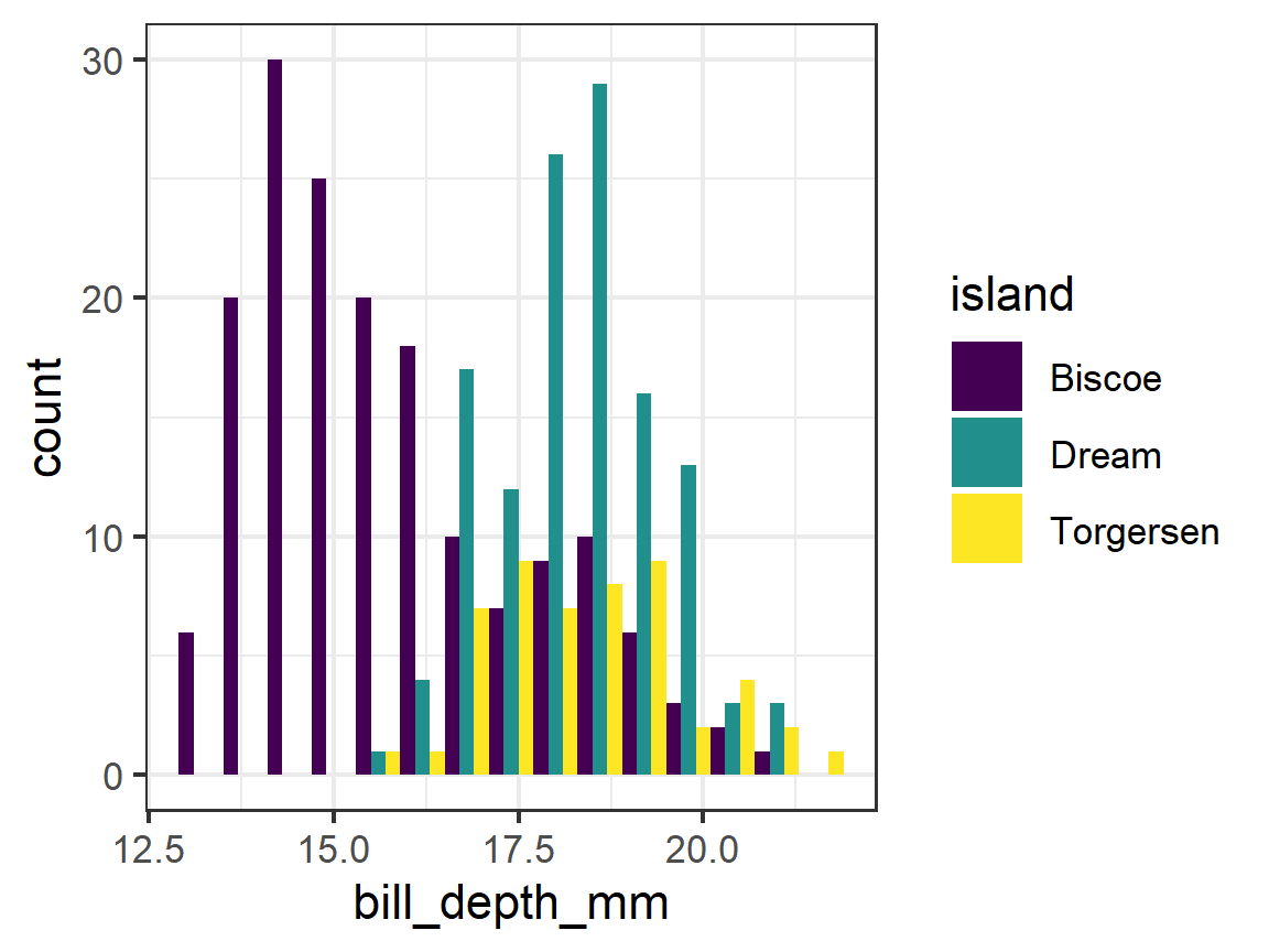
ggplot(penguins, mapping = aes(x = bill_depth_mm, fill = island)) +
  geom_histogram(position = "dodge", bins = 15) +
  theme_bw() +
      scale_fill_viridis_d()
If you want to manually change your colors, you can use scale_color_discrete() or scale_fill_discrete() or scale_color_continuous() or scale_fill_continuous() etc…
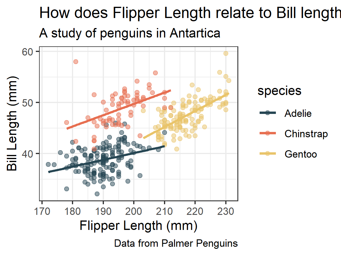
ggplot(penguins, mapping = aes(x = flipper_length_mm, y = bill_length_mm,
                               color = species)) +
  geom_point(alpha = 0.5) +
  geom_smooth(method = "lm", se = FALSE) +
  labs(title = "How does Flipper Length relate to Bill length?",
       subtitle = "A study of penguins in Antartica",
       x = "Flipper Length (mm)",
       y = "Bill Length (mm)",
       caption = "Data from Palmer Penguins") +
  theme_bw() +
  scale_color_manual(values = c("#264653", "#e76f51", "#e9c46a"))
 (colors selected from a coolors palette here)
Theme elements
There is a lot about customization I don’t have time to get into right now. There’s a great cheat sheet here to help identify what part of the theme you want to change and how to accomplish it.
Saving Plots: ggsave()
-
A plots is an R object so you can save it to a variable name just like anything else.
-
This is sometimes helpful when writing functions with plots or creating flexibility in what happens with a plot.
-
To save a plot, you can either print it and then use the R Studio functionality.
p1 <- ggplot(penguins, mapping = aes(x = flipper_length_mm, y = bill_length_mm,
                                     color = species)) +
  geom_point(alpha = 0.5) +
  geom_smooth(method = "lm", se = FALSE) +
  labs(title = "How does Flipper Length relate to Bill length?",
       subtitle = "A study of penguins in Antartica",
       x = "Flipper Length (mm)",
       y = "Bill Length (mm)",
       caption = "Data from Palmer Penguins") +
  theme_bw() +
  scale_color_manual(values = c("#264653", "#e76f51", "#e9c46a"))

p1
-
Enter
p1in the console to see the plot in the plots tab. Use the Export menu button to output as a file. -
You can automate this process in your .Rmd file by using the
ggsave()function- Warning
ggsave()overwrites without asking by default
- Warning
ggsave(filename = "../output/my_first_plot.png",
       plot = p1,
       width = 6,
       height = 4)
Multiple plots
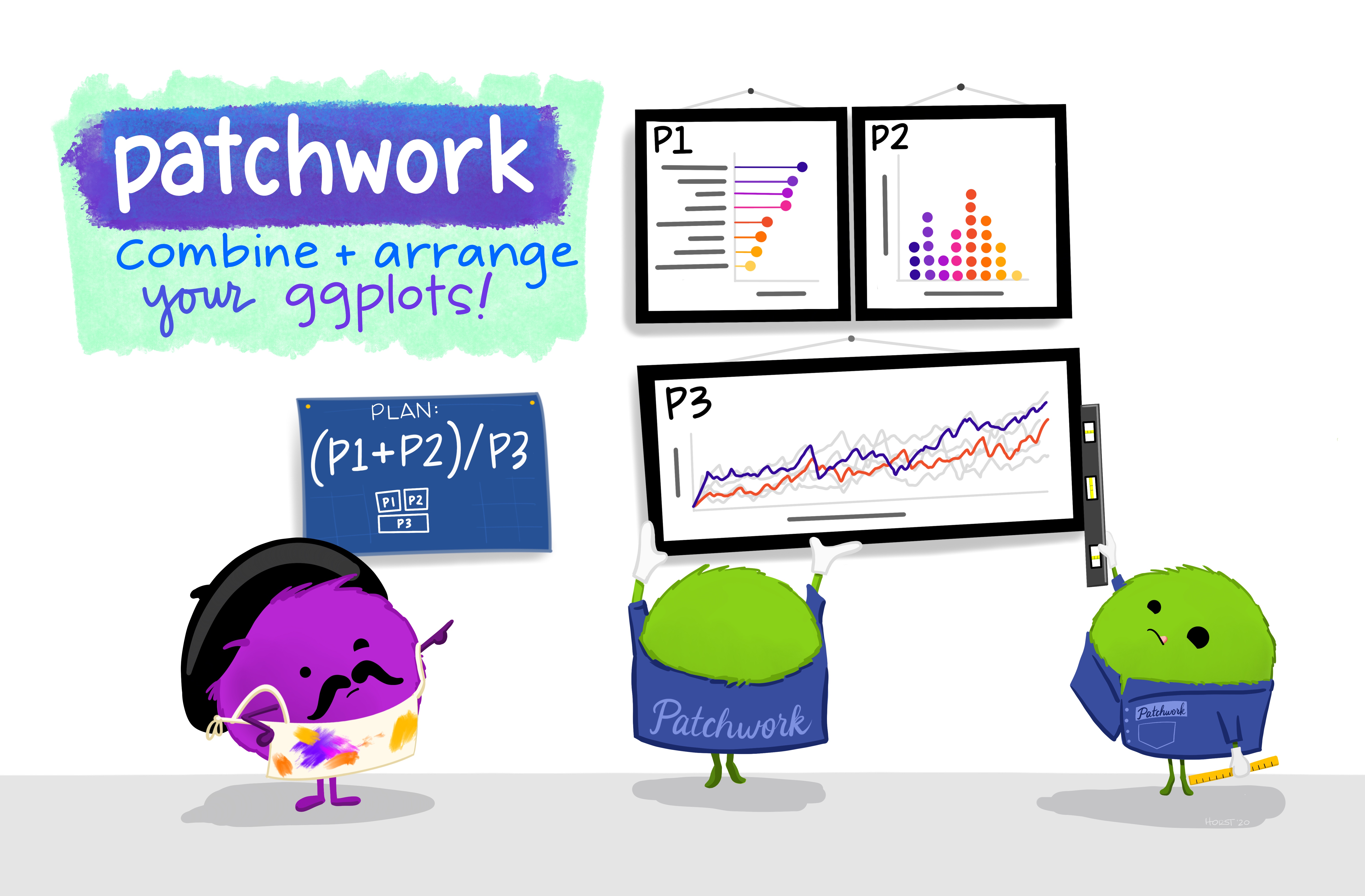
The best way to combine multiple plots into one image outside of faceting is with the patchwork package. We won’t have much time to go into it, but you can learn more on Patchwork here
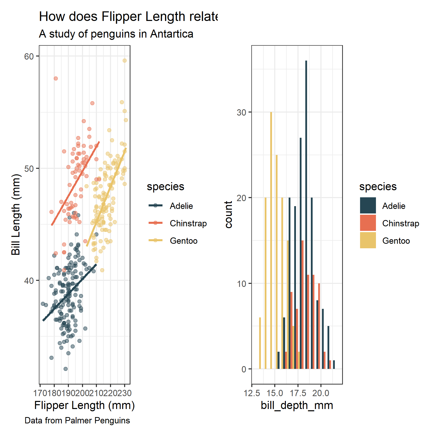
p2 <- ggplot(penguins, mapping = aes(x = bill_depth_mm, fill = species)) +
  geom_histogram(position = "dodge", bins = 15) +
  theme_bw() +
  scale_fill_manual(values = c("#264653", "#e76f51", "#e9c46a"))

library(patchwork)
p1 + p2
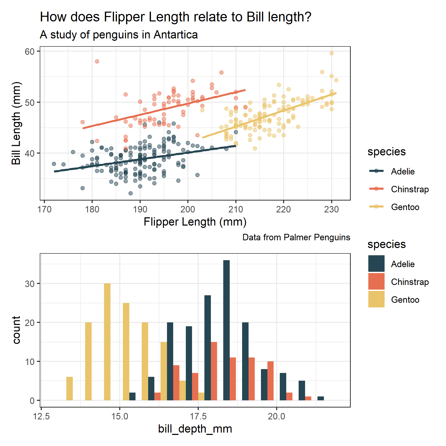
p1 / p2  +
  plot_layout(guides = 'collect')
Annotations
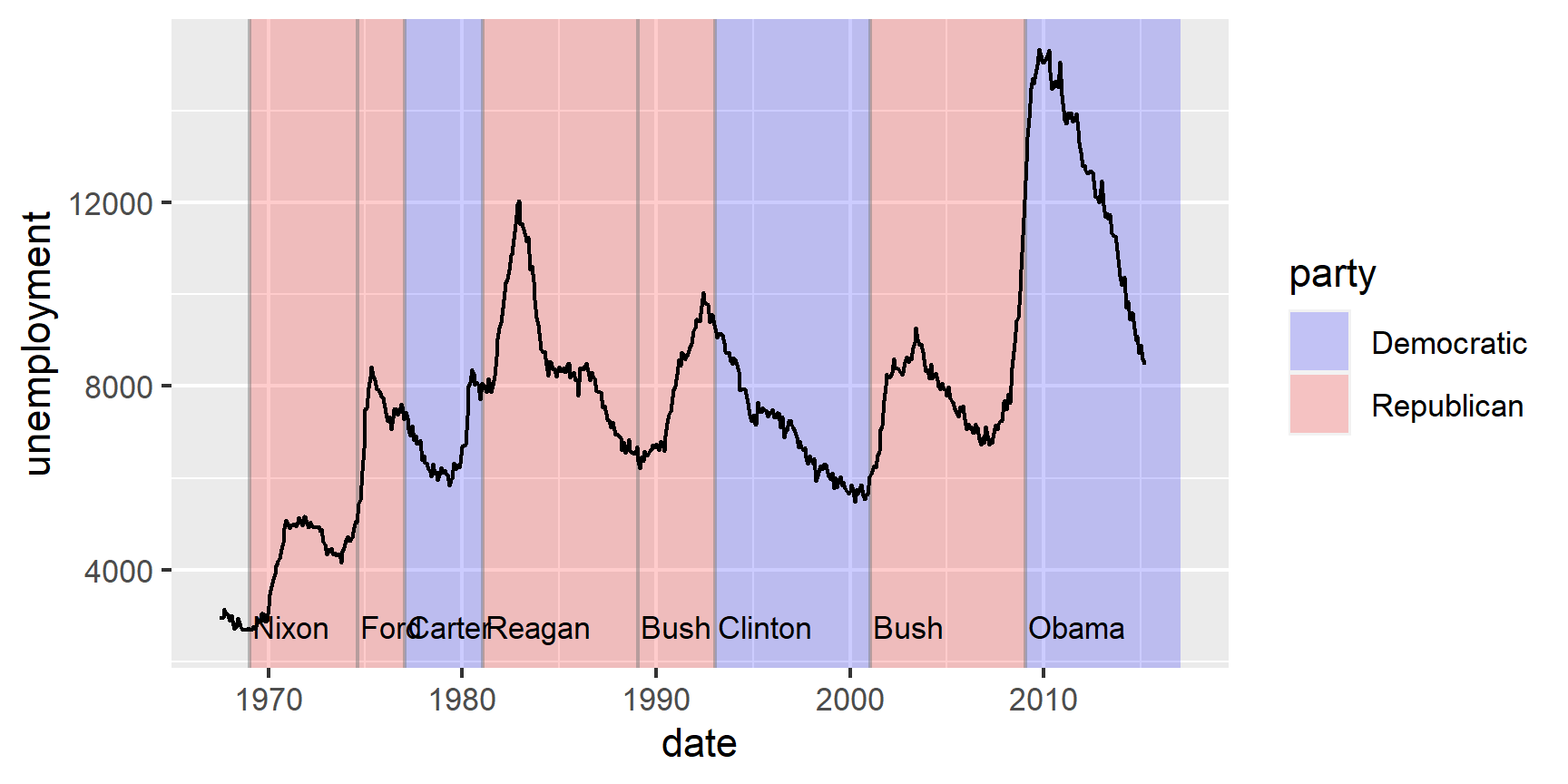
Another thing we don’t have time to discuss is how to add extra annotations, like this
The ggplot2 book covers these pretty well. What
you need to know are basically that geom_text() and ggrepel::geom_text_repel() can add string
labels based on values in your dataset. You can also as custom lines and rectangles using ions
geom_rect(), geom_vline(),geom_hline(), and geom_abline(). If you’re wanting
to add a lot of specific arrows and lines between labels and highlighting different areas,
sometimes an interfacing package liked ggannotate is your best friend!
References
- Chapter 3 RDS.
- Data Visualization Cheat Sheet.
- Ggplot2 Overview.
- Materials from Professor Richard Ressler
Learn more
-
“A Layered Grammar of Graphics,” Journal of Computational and Graphical Statistics 19, no. 1 (January 2010): 3–28, doi:10.1198/jcgs.2009.07098. ↩︎